Luxury Brand Kit 1
Aurora, refined.
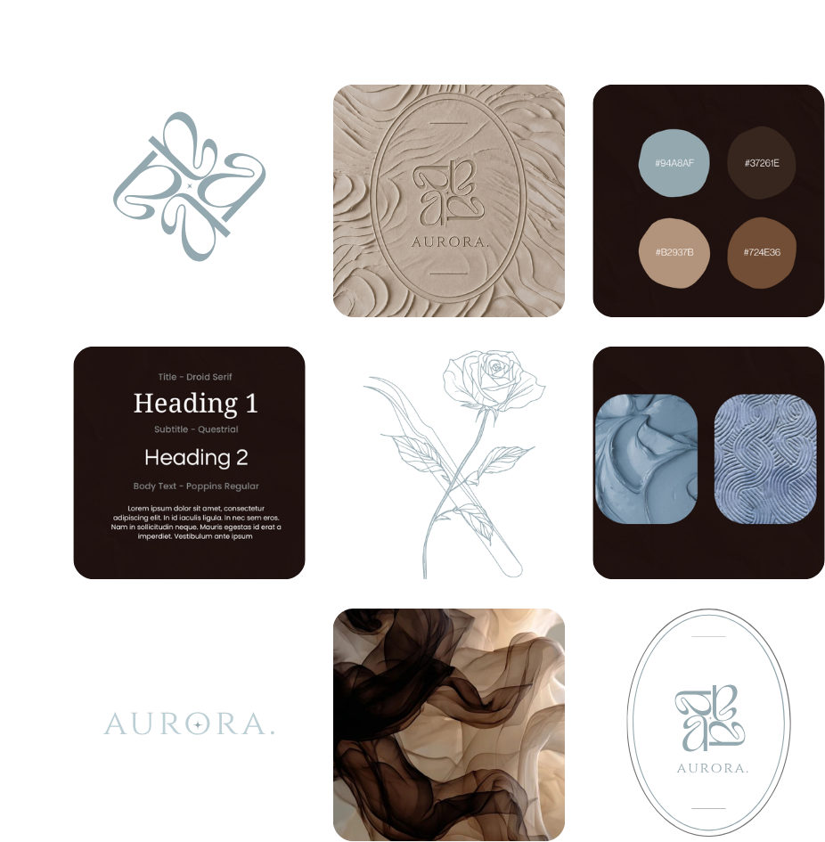
A palette built on quiet contrast, dusty blue against deep espresso brown, with warm neutral undertones that keep everything feeling grounded rather than cold. The interlocking monogram sits at the centre of it all, soft and structural at once, echoed in the oval crest that gives the brand its sense of heritage and permanence.
Texture does the talking here: the pressed clay embossment, the marbled brown silk, the drawn rose in fine line work, all pointing to something tactile, considered, made rather than manufactured. Typography stays classic and unhurried, a serif for presence, a clean sans for clarity, giving the brand room to feel editorial without losing warmth.
This is a brand built to be felt before it's read.